< Back to folio
My Dodo app & responsive website design
My Dodo self service mobile app design
Problem
To decrease the number of calls to the call centre.
To do this we captured the core drivers of why customers call and prioritised these into a set of tasks to design an app that enables customers to access the information they require and offer them the ability to perform the tasks they would usually call for.
User stories
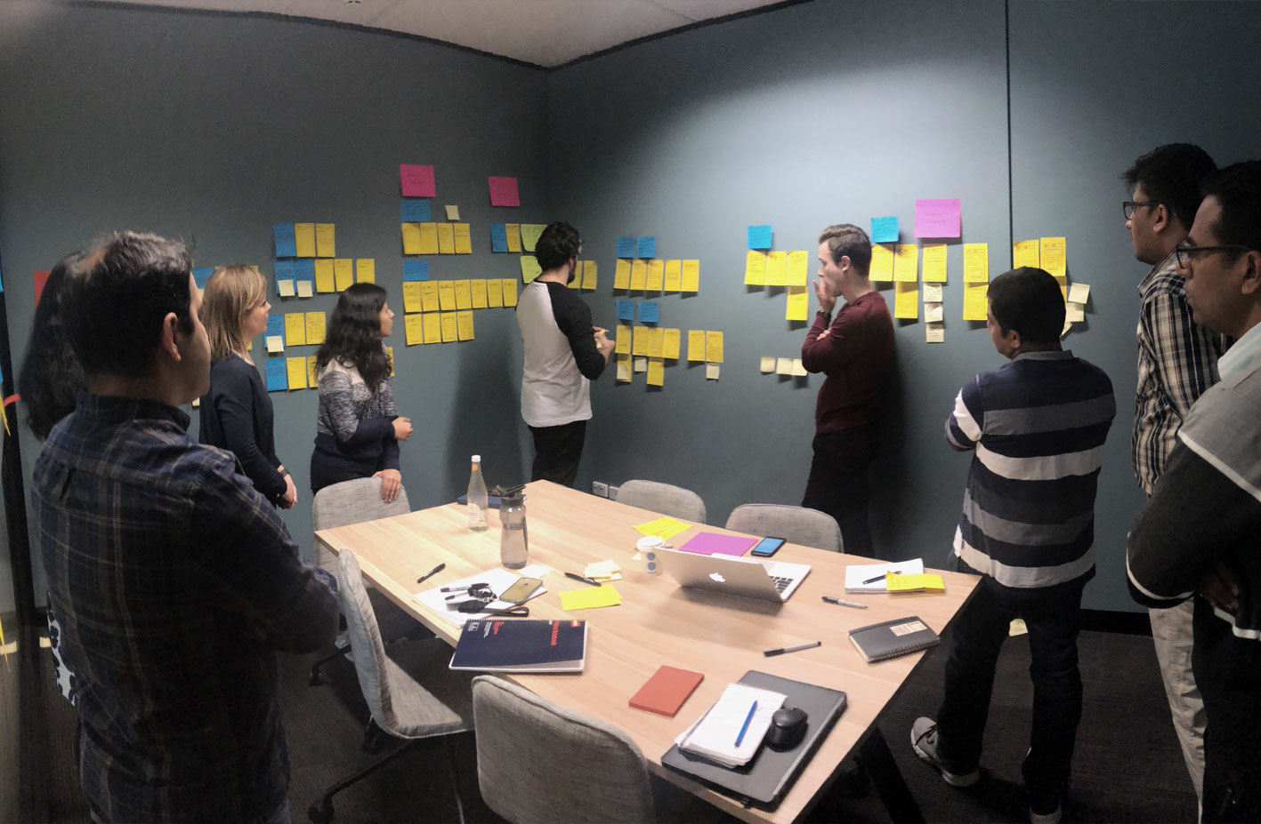
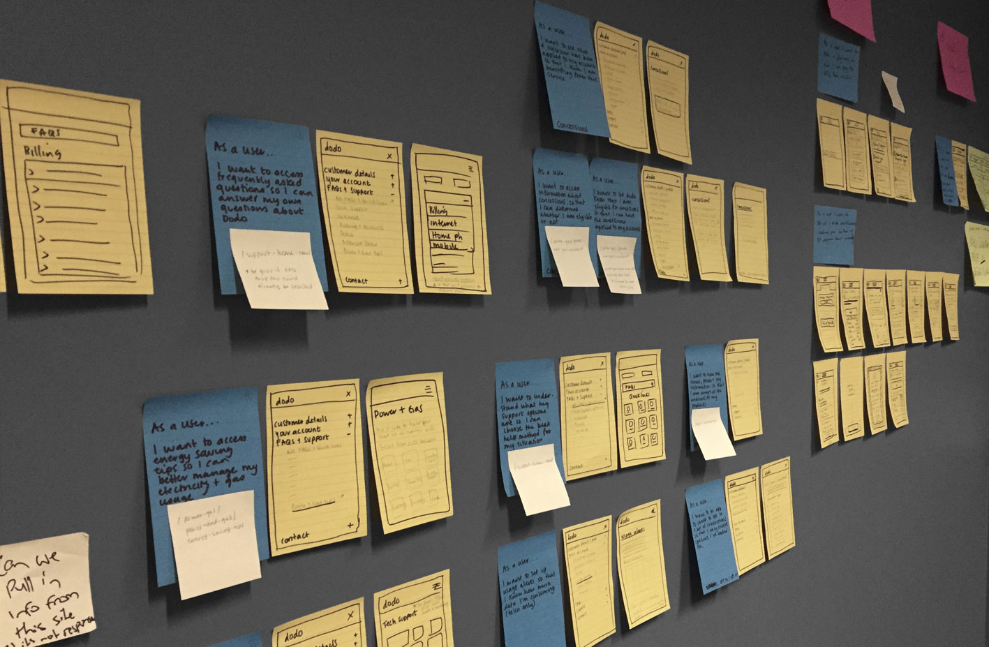
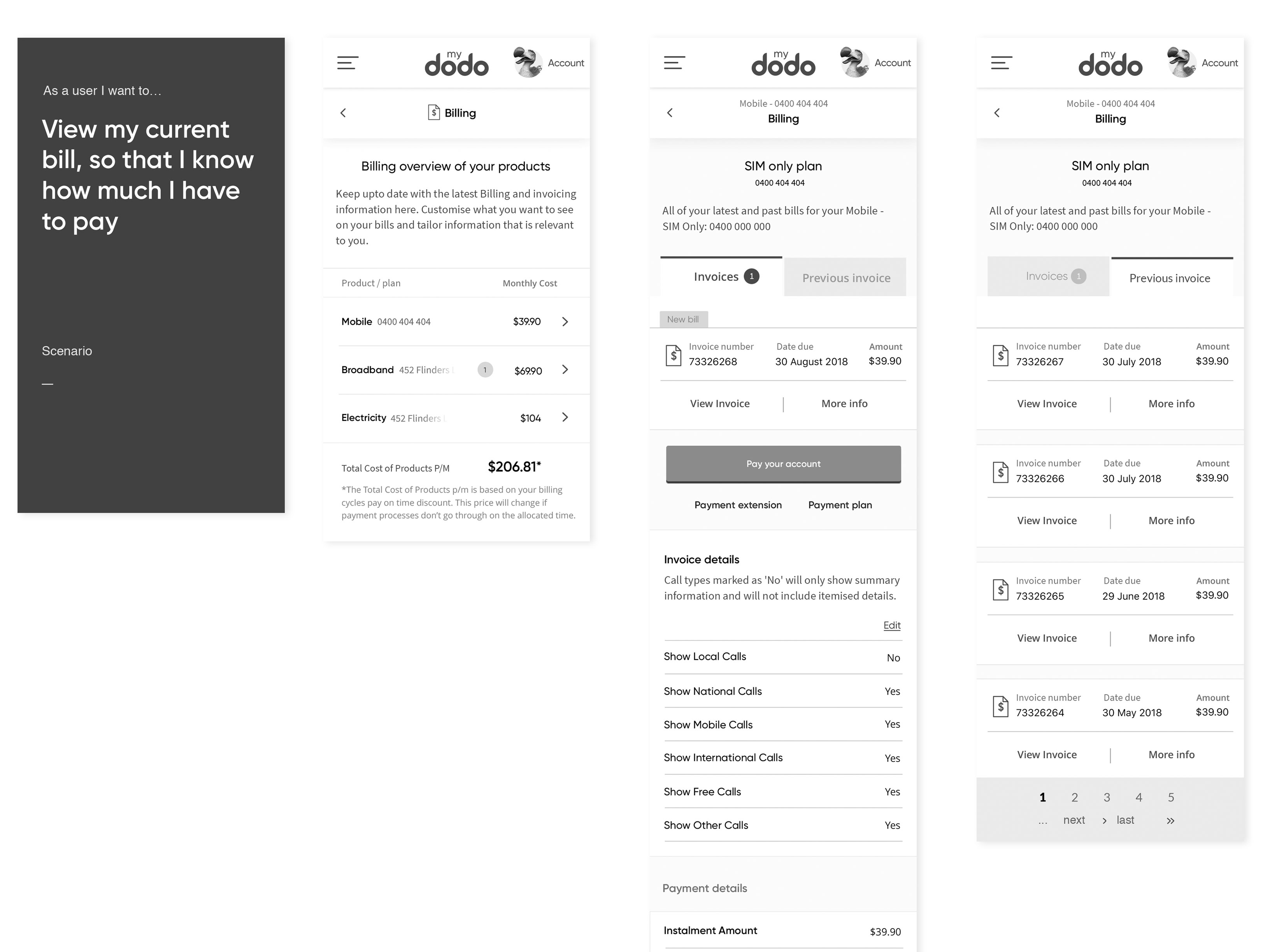
Take the top user stories and turn them into user flows.
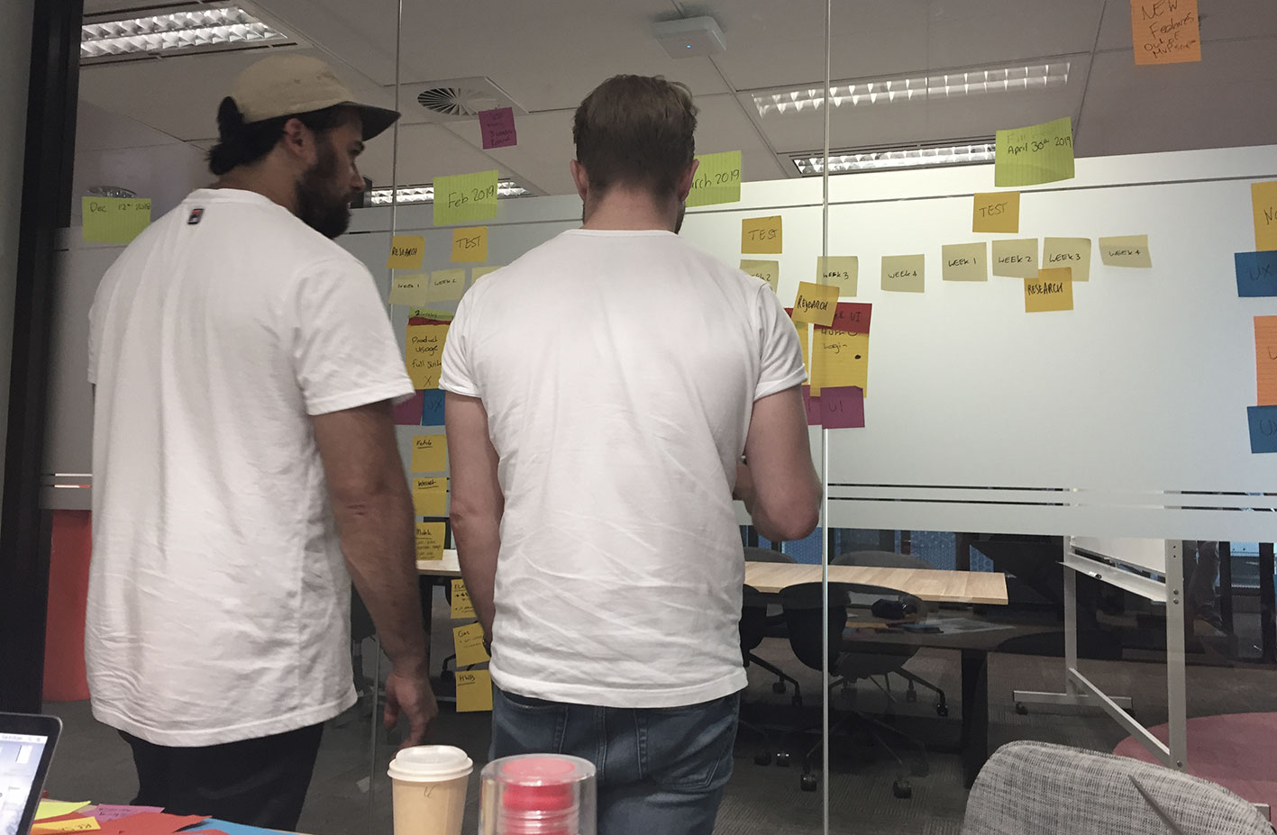
Walk stakeholders through the user journeys to make sure all the tasks are actually possible.
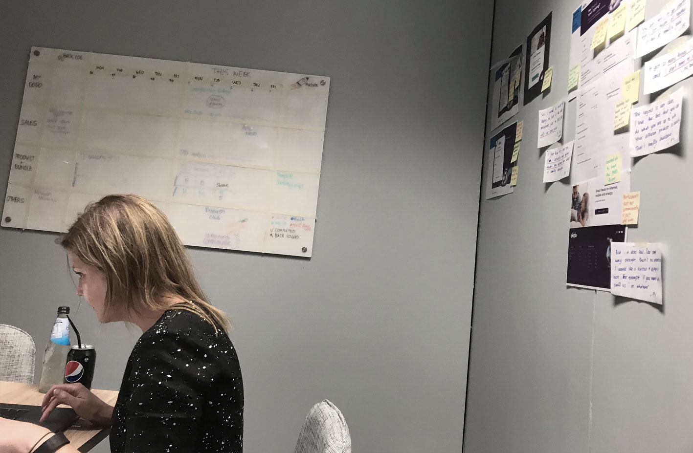
This involved low fidelity sketches of user flows put onto a wall giving people the opportunity to mark up any issues before moving into mid fidelity designs for testing.
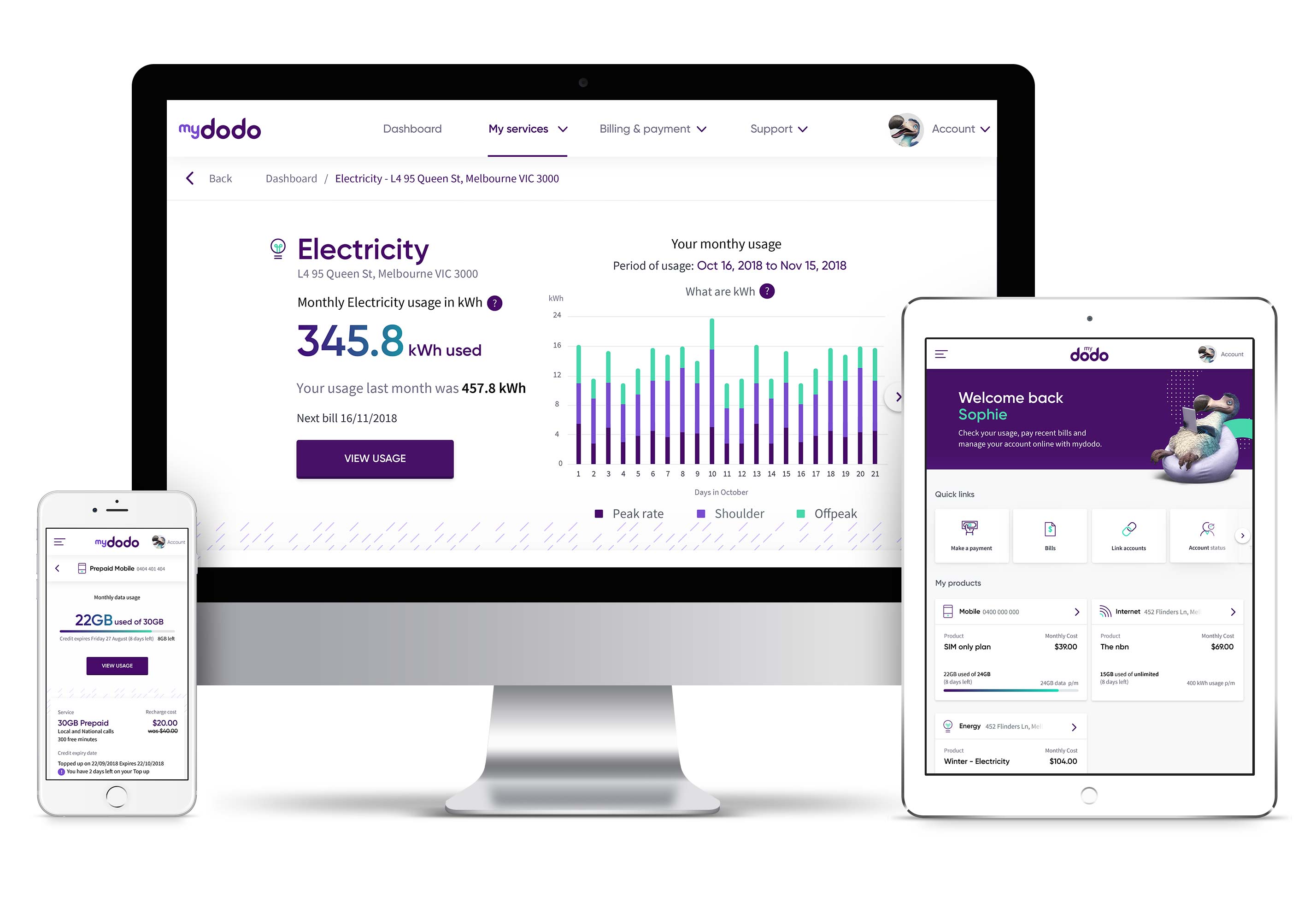
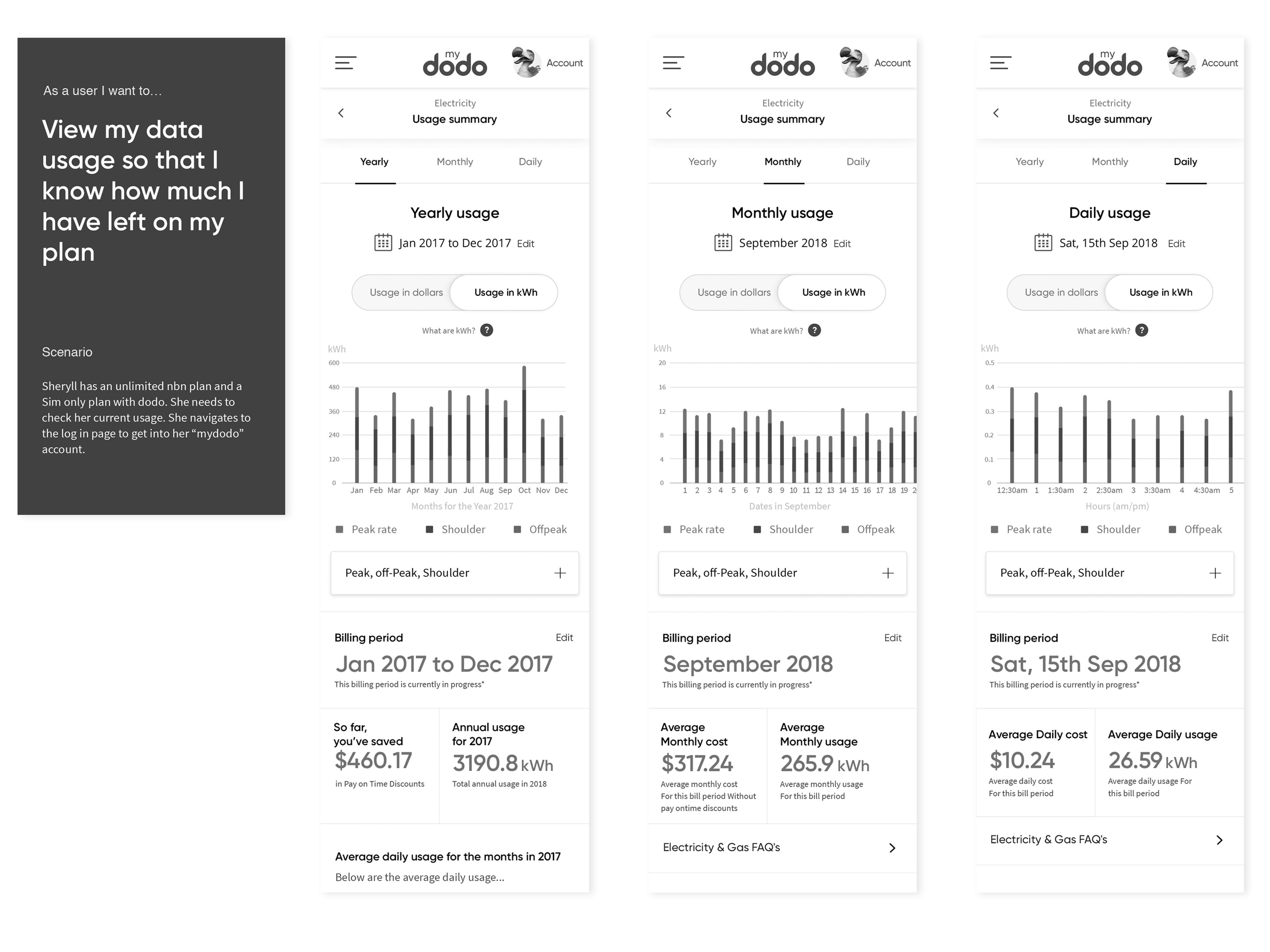
As a customer... how can I view my usage so I know how much data I have remaining?
As a customer... how can I view my my current bill so I know how much I have to pay?
Mid fidelity designs and prototypes
Based on feedback from the lo fi screen walk throughs and some basic assumptions,
mid fidelity user flows were designed in sketch and put into basic interactive prototypes in invision.
Testing and refinement
Regular/rapid testing
The purpose of the research was to gather feedback on mid-fidelity wireframes,
focussing on the key call driver user stories to inform design and concept refinements.
Qualitative research (usability testing interviews) was conducted.
What we were testing:
Warm up activity discussing ideal online account management
Login and dashboard feedback
Find out my balance/usage
Find out details about my plan
Request a payment extension
Pay a bill/payment flow
View past bill and edit invoice details
Linking accounts
Feedback on alternative dashboard designs
Overall impressions and metrics
User feedback quotes:
“It’s in line with Dodo, simple, easy, uncomplicated.”
“The best was how easy it was to check data and
make a payment.”
“Excellent, might move back to Dodo.”
“Very user friendly.”
“I like how it’s neat and clean.”
“It gives you better ways to manage accounts, it
encourages you to sign up to more products.”
Other feedback considerations:
Some of the pop ups were considered intrusive.
With Usage, people would like the option to compare over time.
Finding details about their plan was difficult.
Consider a label that actually says “My account”.
System Usability Score (SUS)
Many testing sessions were conducted in the initial development of My Dodo,
every 1-2 weeks. Over this period of time the SUS score went from 83% to 90% over the first 3 rounds of mid fidelity testing.
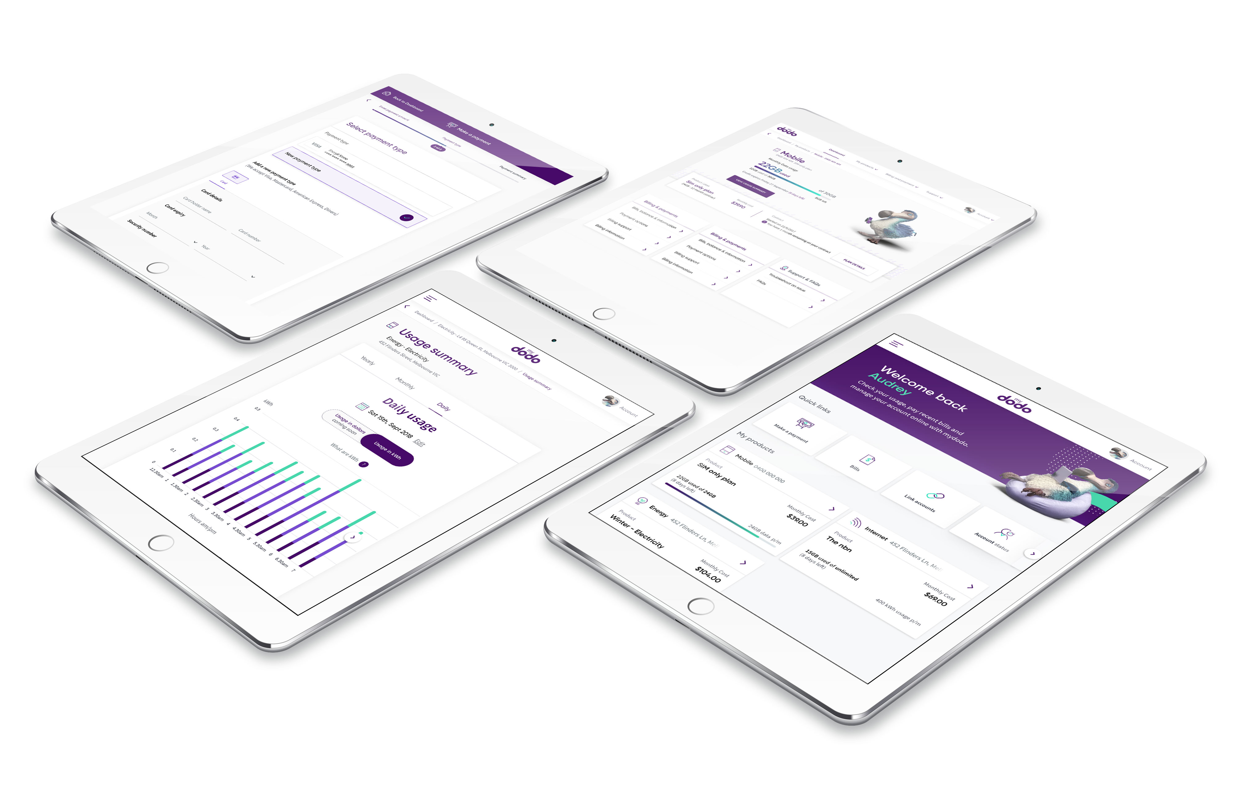
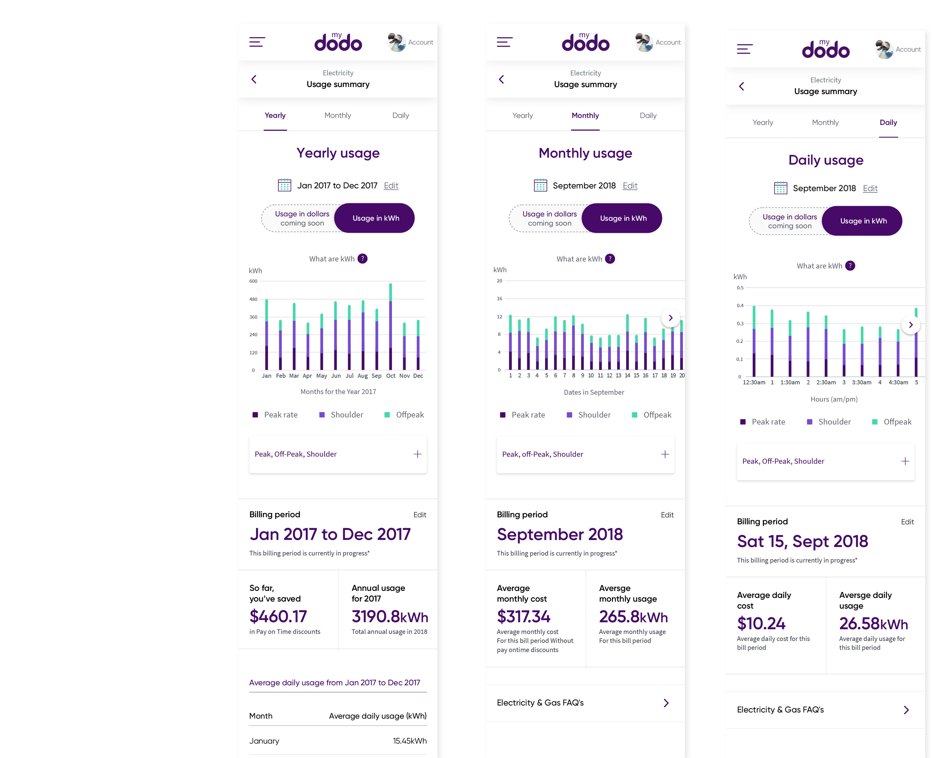
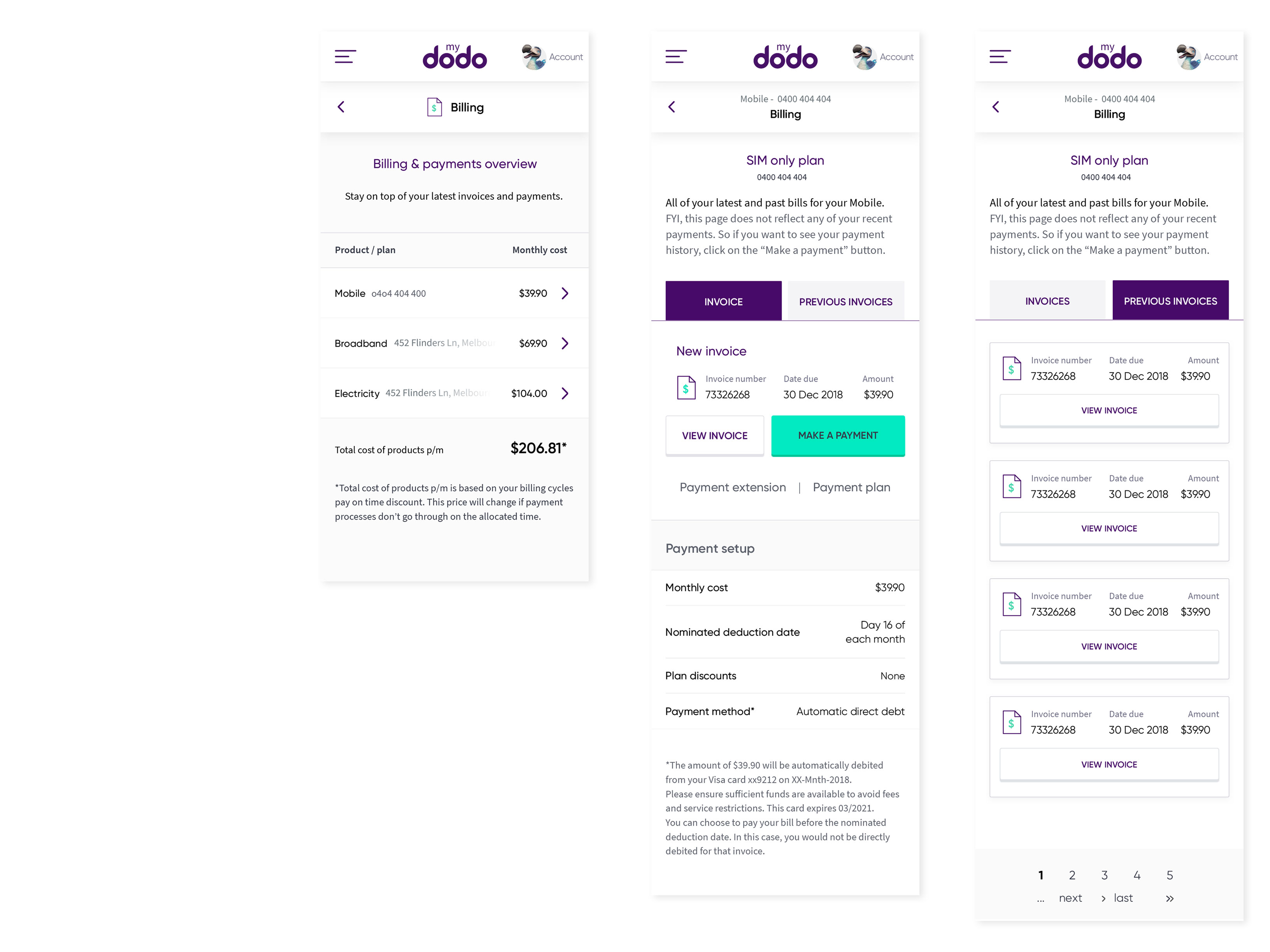
High fidelity design
After mid fidelity user flows were were finalised, moved into high fidelity design (responsive, mobile first, tablet and desktop).
As time was tight for this project, sections were designed and moved straight into development.
Worked closely with the dev team to make sure final designs were as close to the initial designs as possible.
This required working very closely
Tools used
Pen and paper, sketch for wireframes, invision for protoype.
Summary of tasks
Prioritise user stories
Develop lo fi user flows
Stakeholder review
Mid fidelity design and prototypes
User testing
Iterate, design, test and repeat