< Back to folio
Responsive website design
Department of Health & Human Services
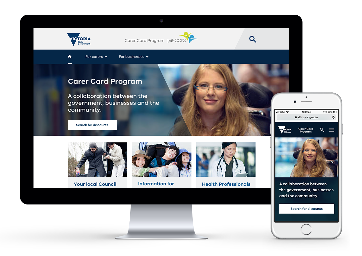
Carer Card Program
Problem
The Carer Card website has been functioning on an old platform with minimal automation for many years.
While upgrading to a new platform there was an opportunity to test and enhance usability, design a responsive website
and align style and functionality with other sites in the Department of Health and Human Services (DHHS) suite.
Analysis/audit
Explore current website, sitemap, usability and interview users. Map their journey, assess emotions, find pain points, gather feedback and provide first round recommendations.
Journey map
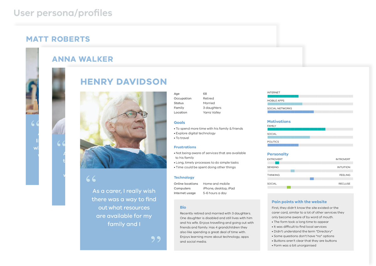
I interviewed a range of people that would have different reasons for using the website. I tracked their actions, motivations, behaviour, emotions and captured their pain points before developing user profiles based on these interviews.
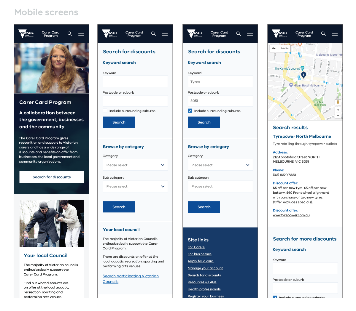
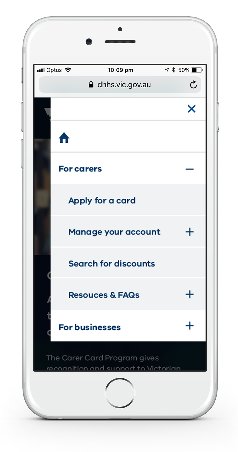
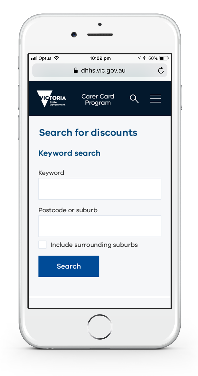
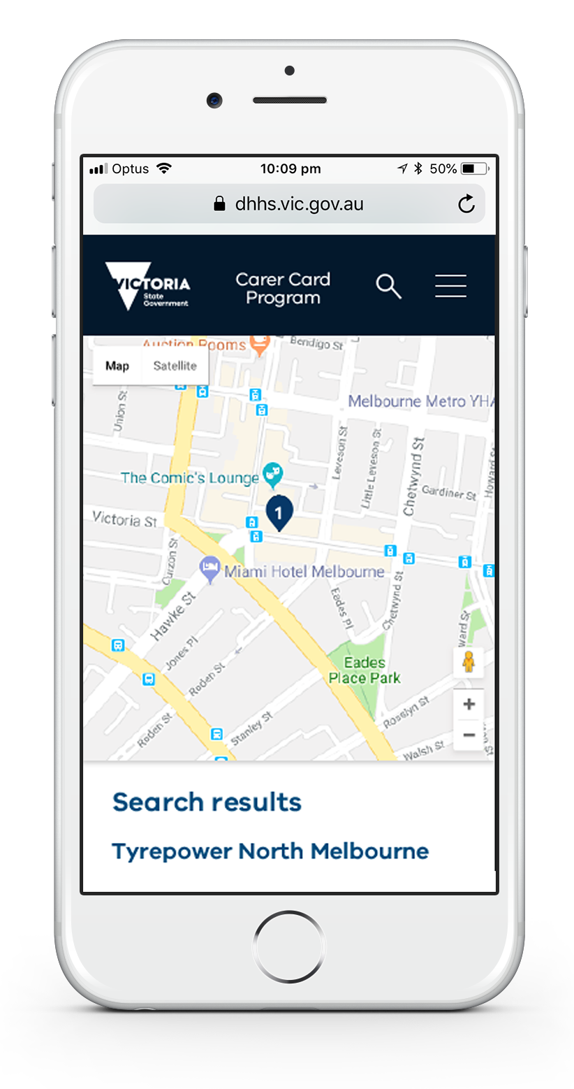
There seemed to be a clear objective when coming to the site and you were either a carer or a business so this was the first decision when it came to simplifying the navigation. Another major pain point was the 3 navigation bars and understanding the terms and definitions. The process of finding local businesses that offered discounts and applying online for a Carer Card also highlighted some frustrations that needed to be addressed.
As a carer... how can I easily apply for a card and find out what discounts and offers are available to me?
As a business... how do I register my business so I can support the Carer Card Program?
Sitemap
I did some card sorting and made some assumptions as to the logical order for where things would sit and then made a prototype to test.
Prototype/user testing
I developed three scenarios for users to perform and tracked their experience, similar to the first round of testing. As we were designing a new site based on a current styleguide for the suite of DHHS sites, the designs were a little more than just wireframes.
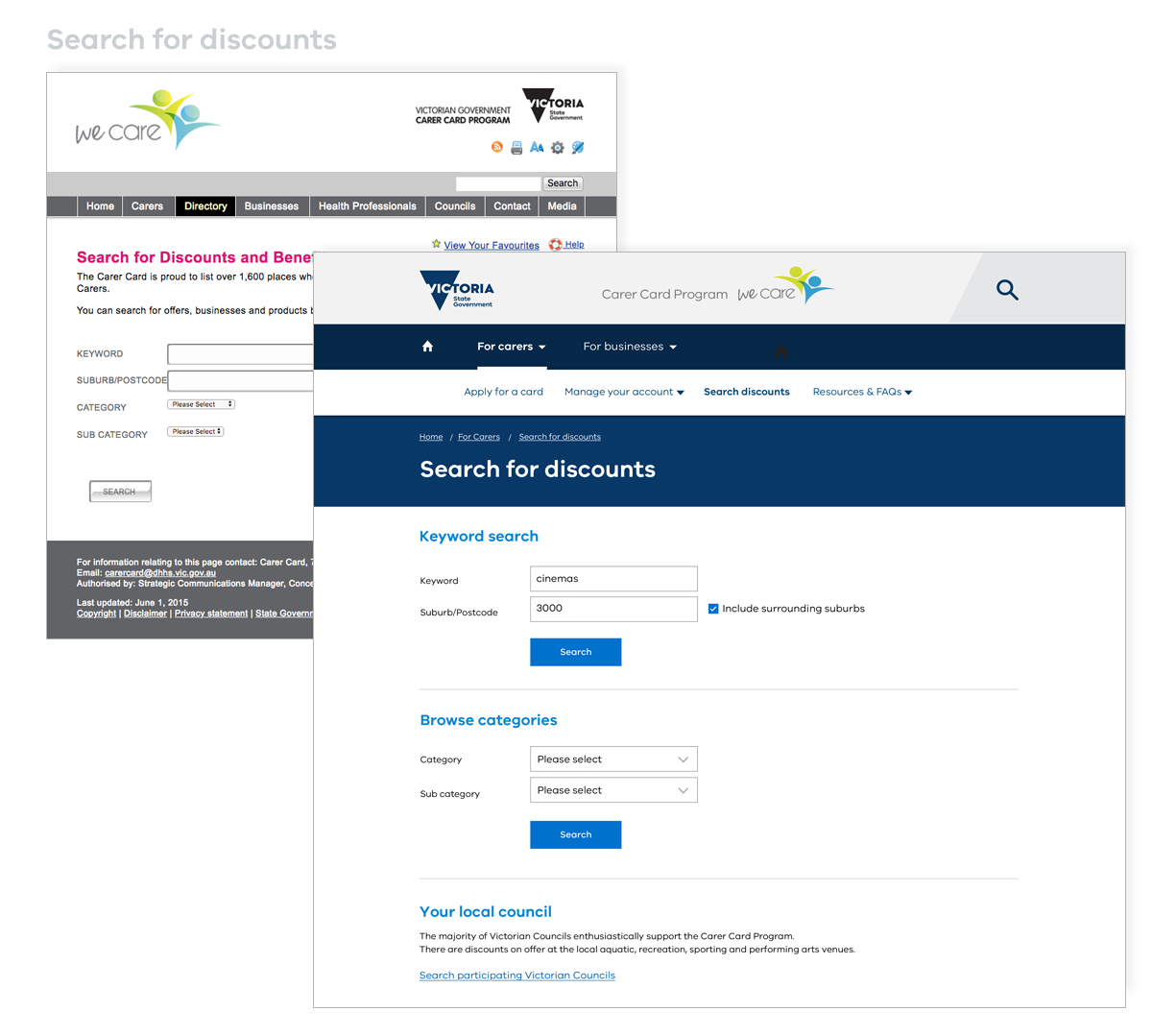
I validated most of my assumptions but there were a few changes required. I decided to put business and council discounts together as people weren't too concerned where the discounts came from.
Added a double nav so people could switch between carers and businesses and made more modifications to the search for businesses layout. We also needed to delete the manage your account section from the business section due to budget limitations.
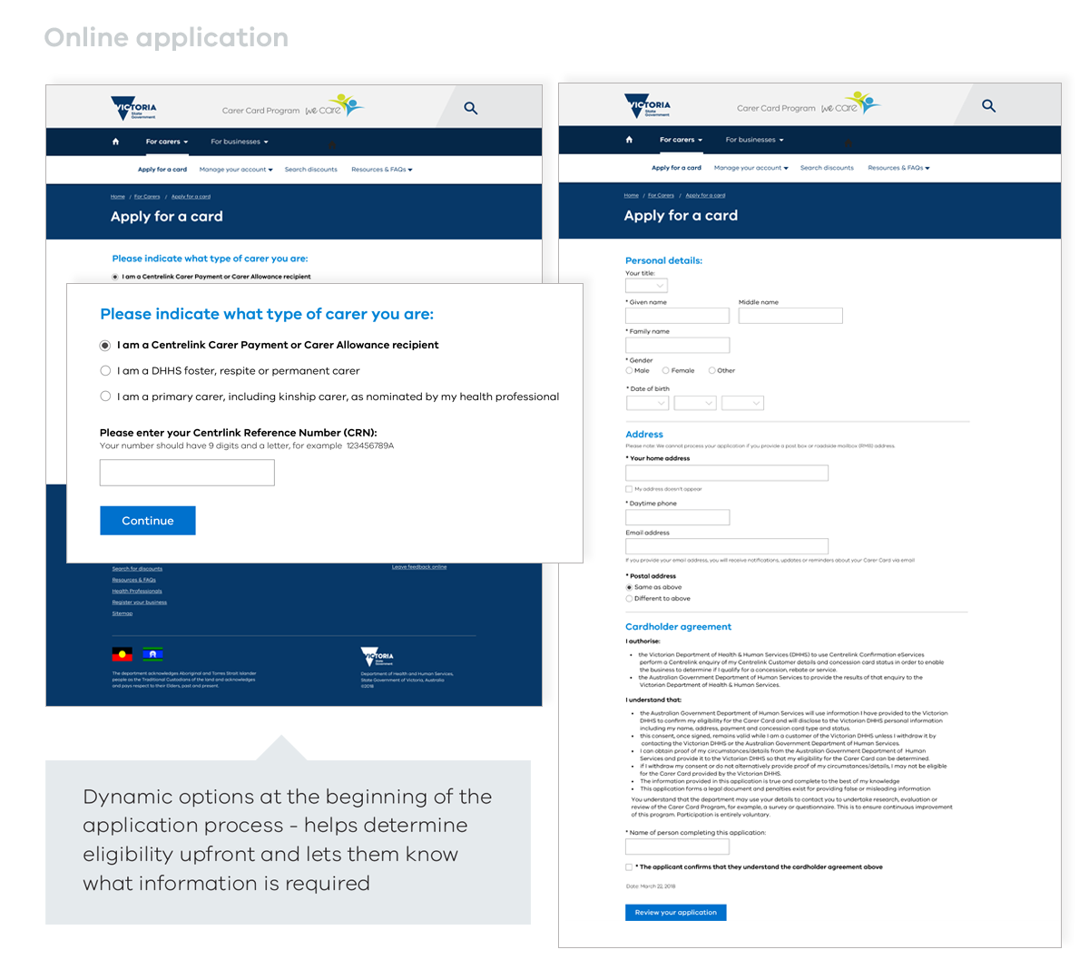
The application form also required work. The current order of details didn't quite make sense to people and they weren't sure if they were eligible until half
way through filling out the form. Some of the fields were labelled badly and resulted in many invalid applications (this was validated with analytics).
I simplified the form, the start of the application process now contains dynamic fields to identify the type of carer you are and the information needed.
Predicitive address fields were added and all optional information grouped and added to the end. The form is now less daunting and much quicker to fill in.
Tools used
Pen and paper, sketch for wireframes, invision for protoype.
Summary of tasks
Define the problem
Journey map
Speak/interview users
Understand user needs, behaviour, motivations
Develop user profiles/personas
Sitemap/IA
Prototype, test, iterate, design